This material was published on the first version of this website in April 2010!
Usability and Interface Design
The need to improve the shape of the product and not the product
TO THE TOPAll the existing software packages are tools for manipulating data and nothing more. Every human should use a software for an easy manipulation of that data and for nothing else. Just using a software is not an objective. Unfortunately, these days there are much too many software packages which do not comply with this requirement. To use these kind of software is a very serious challenge, and the data obtained is only a price for the user's patience and commitment.
[story:] The Hammer
For nailing you need a hammer. If you don’t have one you can use the Beethoven marble head, or even a rock. After all, the first hammer was a rock ! But people were not content with the rock and they invented the hammer. And this wasn’t an easy task. Think about all of those crushed fingers ! Even after the humans successfully invented the hammer, they make it in a huge numbers of shapes and even colours. This is called optimisation! That means less crashed fingers!
The purpose of the interface design is to improve the usability of the software for those humans who work (or play) with them. An interface designer takes care that the features of a software are optimised in order to offer psychological comfort for the user. For an interface designer the purpose of a program is less important than the way of using it.
[story:] The House
The primary purpose of a house was to protect the occupants and their belongings from the weather and neighbors. For this was sufficient to live in a cave with a faithful dinosaur at the entrance. Today the primary purpose of the house passed the second. Now a house is built to provide psychological comfort. First of all, a house has to be enjoyable. Often it has to please other people than the occupants because of the "integration in the architectural concept of the zone” (we know – the world goes mad). Regarding usefulness, we reached refinements such as "eco-house", or fire protection facilities, or exterior windows washing safety. This is why, when you build a house, you need an architect and not just a bricklayer.
The job of the interface designer in builiding software is similar with the job of the architect in construction!
An interface designer intervenes in creating software throughout the entire production chain. In fact the role of an interface designer is to coordinate the entire developing team. It is wrong to believe that, two weeks before delivery, an interface designer will solve whatever means “usability”. Yes, a magic stick could be useful but we recommend to be used in other purposes. To be effective an interface designer should have multidisciplinary training, especially if the area of a particularly software application is a specific one.
The main cause of an improper interface is that it's developed by the wrong people!
Very few of those involved in developing software are able to separate software interface development from building the software itself. This is why many times people developing the interface are programmers themselves. But programmers could be good interface designers only if they do it for programmers addressed software.
Some criteria for recognition of a software with wrong interface:
- Asume that the user is predictable.
This is mainly happened when the interface developers are programmers. They assume that, under any circumstances, the user will not start to use a software before a very careful and complete learning of the manual. To go even further, they assume that the manual is efficient (there are more chances to see a flying saucer) and that the user will follow exactly the commands in order described. This is without exception always false. A human choose randomly the execution of day to day actions as long as there is not conditioning between them.
[example:] Random human actions.
When you set the table for the dinner, doesn’t matter the order of putting plates, forks, spoons, cups or whatever instruments on the table. What is important is that at the end to have on the table everything needed for an enjoyable meal. That means a cold beer in refrigerator (personal opinion – we don’t stimulate alcohol consumption). Imagine how do you feel when you are trying to put a knife on the table and someone would ask you if “are you sure?” suggesting as possible answers “yes, no, cancel”!
- Inappropriate way of treating errors.
There are two kinds of errors: computer errors and human errors. About computer errors we have nothing to say because are not related to interface design. About human errors using computers we can write books or make movies! Imagine an operator announced during whatever task execution that he is the lottery winner of 1 million Euros. Could you blame him because he sent by mistake 20 haute-couture dresses to a farmer and 200 kg manure to a fashion exhibition? Of course you can! Damn lucky bastard! Back to our business. The main purpose of the computers is to help humans, even if that means to help us managing our own errors. An error message which just acknowledges you there is an error without anything else is not helpful. Also it’s not helpful if the message offers inaccessible solutions or even worst, it makes you feel like a five years old child. A software with a friendly interface would blame itself for not being capable of anticipate that error in order to find a solution. This is not a joke. A computer has no feelings, so it could take the blame. In most cases it expresses the programmer’s feelings, which is not the same. How could the software anticipate and solve the problem generated by the lottery winner? We have no clue, but we liked the picture.
[example:] Computer solving human error.
A common software-task is the requirement of input a numerical value. In the real world, if the value is inappropriate, an error message appears informing the user about it, the message waits for a confirmation, and after that it allows the user to input a new value. If a new rule is broken the process is repeated. In a perfect world, the software suggests a solution, show a message about it but it should wait for a confirmation only if it’s necessary before going further. What means suggest a solution: if the number was a real value and the requirements was for an integer, the solution proposed could be the closest integer, if the value is bigger than a certain limit, the proposed solution should be the maximum value admitted, and so on. As you see, the perfect world is very close.
- Equal treatment for all software features.
It sounds strange, isn’t it? In a routine operation of a software, some functions are appealed more often than others. As a matter of fact, 80% percent of the users work with only 20% of the features of a software. So instead of using four mouse-clicks to execute all functions, an optimised software will provide 2 mouse-clicks for execution current operations and 5 mouse-clicks for those operations accessed once at every 2 months. This problem is solved mainly with the shortcut icons from the toolbar. The interface designer must decide what functions are most frequently used and in what circumstances. A bigger challenge is to decide how the frequency of using an entire software will affect the interface design.
[example:] The importance of frequency of use.
A software package is used to count penguins. At the South Pole, every user will become a professional user within hours. This means that software designers need to optimize a quick way to access the most common features at the expense of optimizing an interface allowing advanced support for novice users. In the Sahara desert on the other hand, the software is used at every ten thousands years (at every major climate change), so for any user is a beginner. In this case, detailed information on how to use the software will be more appreciated than easy access to functions. Warning: the software can not count camels. This example raises a most often unexpected problem: the software use in other purposes than originally intended. Our software can not count camels because the counting algorithm is based on the combination of counting penguin feet and analysing the height of the living beings passing through some sensors. An algorithm based on counting the heads of living creatures would be able to count both penguins and camels, but also will count humans or dogs which are neither penguins nor camels. So if a software package can be used for an unplanned task, probably the primer task is not executed properly.
- Low scores from the usability tests.
We should start with this one. But conducting and interpreting an usability test is everything else but an easy task. We will treat the subject in next chapters, but if you are eager to test something download the following material: System Usability Scale download (click). Apply the test for job used software and for your favourite movie player software. Compare the results and you’ll know if your work day could be better. By the way, the test was conceived in 1986!
From the interface design point of view, it's more important HOW it's done than WHAT it's doing !
For building the interface for a given software is necessary to fully understand the way that software will be used. This means to understand both technical requirement and human behaviour of the user. The human behaviour includes details like psychological profile, health condition or professional relations inside a team. This kind of details makes the difference between the products of different competitors on IT market.
Finally, we must clarify what actually means “interface”. The interface is the sum between the workflow (what functions, when and where they are appealed) and the visual elements (shapes, colours, fonts). As you see, none of these components have anything to do with programming. But it is very important that the interface designer should have at least average programming skills in order to facilitate communication with the programmers.
* * *
The User
The centre of the “interface design” universe. Human behaviour when the human is the centre of whatever universe.
TO THE TOPIf a software package will be used by human beings then its development must include an analysis of its users. This analysis has two components: accurate and complete identification of the users and a detailed analyze of the characteristics of that class of users defined previously.
Identification of the users-class is not an easy task. Many IT managers are not even aware about this necessity. This kind of managers has an "inner certainty" that the software is required and it will be successful anyway. The probability to find people to use the software once built is high enough. After all, we are two billion people using the internet. But the probability that a sufficient number of people will find out about this software and they will pay a minimum amount to make it economically viable, is low enough that it warrants some feasibility studies.
Identification of specific users allows not only building an user profile but an assessment of potential revenues.
We name “users” when we refer to people using a software, but this definition is not accurate. In terms of interface design, the user is the sum of some abilities and imperfections. Take in consideration a software which has to control an equipment. In this case, such items as age, gender or culinary preferences of the user are not relevant, but level of education and degree of attention are important. The features associated with manipulation of a given software form what is called “persona”. “Persona” is a slice of personality and behaviour of human beings. Obviously every human being is made up of several "personas". It does not mean that we are schizophrenic. Or maybe we are, but not all of us need treatment. Examples of healthy people with multiple "persona". From now on in this learning tool, we continue to refer to “user” as the “user” and not as “persona”. We have all of this “persona”-talk to emphasize how important is to define accurate selection criteria when you must identify a users-class. After all, it would not be effective as a chemical reactor controlling software to be tested with the staff of a supermarket.
Benefits of developing an user profile is obvious when software packages offer is generous. The best example are online platforms. It does not matter if we are talking about social platforms or virtual stores. What differentiates them is just how user preferences overlap with software’s features. Because web area is so dynamic with so fierce competition, the best manuals on usability are those dealing with the web domain. The effects of a proper interface is first an increase in revenues recorded by the producer or owner of the software and a higher satisfaction of users in the second. These priorities are reversed when it comes to niche areas, such as scientific. Particularities of this area will be described in detail in Chapter 5.
Never ask the user what (s)he wants.
Do not ask the user how the software should look like. Suggest solutions and let him(her) choose. The user does not have specialized training in the construction of interfaces. In addition many times (s)he describes a projection of desires, which has little in common with the needs. The user describes what they think would be useful and not what it really is.
[example:] Things that users do not see.
Suppose a test of using a mobile phone. The task is to dial an often called number. The user is urged to rule out loud stages before being executed. The first step will be something like "unlock key" or "open recent calls list”. It is very unlikely that it starts with "check battery level”. Termination of calls because the battery is consumed is very frustrating and most users would consider it outrageous that they were not warned. The user starts with the assumption that the phone works which is not always true.
[example:] Things that users do not take in consideration.
A student uses a program to solve a mathematical equation. Program solves the equation with high accuracy using several methods. The result is expressed as a numerical table form in an ASCII file format. This student is very content with the results and that is what an observer find out after all tests. But, obviously there is a "but", after taking output from the first software the student place it in a second software to represent data in a graphical form, more enjoyable. First software does not allow output into a graphical form, and this is for sure a minus. But the user is interested primarily in accuracy and will not consider the output important. Even so, if the software would provide more sub-options, surely the user will appreciate it more because finally there is less work to do.
[example:] Wrong question, erroneous conclusion.
Would you like to be the proud owner of a 50000 Euros car? 90% of you will answer “yes”. But what about this questions: Would you like to have a two seat car with no space for luggage? For sure the percent is lower. Both questions are referring to the same sport car, but it’s clear that images associated with each questions are very different.
* * *
Usability Testing
If your software is a piece of garbage, at least you should know why. If it’s a sell-buster, you don’t need us anyway.
TO THE TOPTests with users are very sensitive. The declared purpose of these tests is to verify the proposed models for a software package (efficiency of association, ease of access of certain functions, speed of execution of certain tasks). A more general purpose is to obtain maximum information from the interaction between a human being and a software interface. The problems appear when the test-users are not treated as human beings but as robots: sit down, execute, stand up, and hit the road.
Avoid to put the test-user in embarasing situations.
Some definitions to keep confusion out:
- Test-user: the king (or queen) of usability test, the person who is used for testing.
- Moderator: the person who coordinates the test.
- Observer: the person who watches the test and quietly takes notices.
About test-users:
After the usual formulas of greeting and courtesy, the test-user must know his(her) role: to help developing a product. The test-user must understand that the difficulties in completing a task are useful because this is the way to rectify the errors. In any case a test-user should not be placed in a state of inferiority because it fails to properly or timely complete a task. This may happen very often, the moderator must be able to control and properly manage a possible failure. Even before testing is recommended to give to test-user a detailed description of each task that must be accomplished.
About moderators:
It’s better if the moderators are sociable persons. They must be able to create the appropriate atmosphere to conduct the test, to provide the correct information necessary for completing the test, to be able to communicate with both test-users and development or marketing team, to be able to build perfect scenarios and tests, to acquire useful information. It would be better if the moderator and interface designer of the product are one and the same person. This way, communication problems inside the developing team are minimized and after all, if something goes wrong the managers can blame only one person.
About observers:
The observers are some kind of moderator’s assistants. Their role is to cover through their notices details that the moderator might have overlooked. On the other hand, it is advisable to be admitted as observers managers and programmers involved in the software development process. This way managers will understand the necessity for such tests, and programmers will more easily accept that purely technical solutions are not very popular.
Finally about usability test:
An usability test consists in a task which the test-user must execute. Sometimes the task is included into a more general scenario which defines some hypothetic initial conditions. The moderator must anticipate the evolution of the test in order to identify the difficult steps. A rehearsal with one member of the development team is very useful. If the test-user didn’t approach the task in the same way as the moderator did, it’s not something unusual. Guessing an answer is more fun than logical deduction and reflects the human ingenuity. Sometimes this is not ingenuity but 100% stupidity, but in most cases is only temporary. It comes with the human nature. We know it, because temporary we had it too. Nevertheless, even in this kind of situation the test must be considered successful. In fact, an usability test is a failure only if one or more participants loose their control (doesn’t matter if the loony guy is the moderator, a test-user or an observer). The conclusions generated by test must be summarised right after the end of the test to be sure that important observations are not lost.
The usability test can be performed with one test-user, a pair of test-users or with an entire group. The test could take place in a special room, through internet, or even by phone. In early stages of software development some paper prototypes could successfully replace the computers. There is only one thing that the moderator should always remember:
An usability test never substitutes the real life situations.
* * *
If something is changing fast in the interface design then we talk about the visual elements. The definition we gave them today will be changed tomorrow.
SORRY FOLKS, THIS CHAPTER IS FOREVER UNDER DEVELOPMENT!
* * *
Interface Design in the Scientific Field
Why you don’t have bikini-girls near the fire alarm in a nuclear plant control software.
TO THE TOPThe scientific software is a specific software and it requires special attention. We call it “scientific” because we didn’t find something smarter, but we refer to any software with a narrow field of application (software for operate a high-tech equipment, or for controlling the flights on an airport, or for monitoring working condition in a mine).
General principles that characterize scientific software:
- The users are highly trained and adaptable.
If they have a problem they will approach all posibilities in order to solve it. Ultimately they will even read the instruction manual. Very often, the scientific software users must improvise and seek for alternatives and only if everything goes wrong they call the software producer.
- The software misused could have extremely serious consequences.
An confusing information or a wrong placed button can lead to lost of human lives. Of course this is the worst case scenario, but even a small unnoticed warning could generate a long chain of unpleasant events. All commands and the associated texts must be above all doubts. Also, more than in other situations, the psychological comfort of the user should be a mandatory requirement.
- Building scientific software requires extremely delicate collaboration between highly qualified specialists in various domains.
All scientific software are multidisciplinaire projects. If the biggest challenge is to find a common language between team members, an underestimated challenge is to maintain peace between the “egos” of numerous personalities involved in project. If the chairs start flying in the meeting room, you must put a shrink on your pay-roll for limiting the damages.
Unsuitable approaches widely spread in scientific software building:
- The scientific software is regarded as an unprofitable necessity.
Because of this concept, the managers will try to keep expenses at minimum and first consequence is that they will not hire an interface designer and they will conduct only the minimum usability test necessary. The tests are performed mainly to correct bugs and not to improve the usability of that software. The managers justify their decision with the small number of buyers and with the necessity of hiring specialised personal in the development team. The true reason for the small budget is in fact that the users rarely complain. As we already mentioned, they will struggle with a bad interface rather then ask for a better one. The solution for this situation is to integrate the software into a coherent selling strategy. If the clients have to choose they will prefer improvements in the software interface rather than in the equipment controlled by that software. This is a fact proved by numerous case studies and fully confirmed by our experience.
The users prefer friendly software on medium quality equipment rather than an uncomfortable interface on high quality equipment.
- The software is designed for the equipment and not for the user of the equipment.
The main concern is about covering the equipment functions and not about how the functions are used by an operator. The manufacturers of the equipment should not consider that the users have the same knowledge as they do about that machine. This is why sometimes the software provides small information about algorithms and working procedures.
- Development team members get the best results if they will stay locked together into a room for one week.
Put together in the same room an elephant and a tiger and explain them that they get food only if they work together to make the circus profitable.
Any interface designer should know where to place some buttons and how they should look like. If carefully follows the daily activities of potential users of a product they will deduct the correct order of execution of certain specific commands. But to build an interface dedicated to a niche sector, they need at least basic knowledge of the area addressed, because there are a lot of small details, so ordinary for the specialists then they will mention them mostly accidentaly.
[example:] Hidden details in electrochemistry.
Graphical representation of current vs. potential should not cause a problem for software developers. This graphical representation is known for the electrochemists as "voltammogram”. But you can not name it “voltammogram” unless the current doesn’t have the sign “-” in the top of vertical axe and the sign “+” in the bottom part of vertical axe. It sounds weird? It shouldn’t, this convention is associated with the electron movement inside and outside of an electronic circuit.
We mentioned in previous chapters that is more important how a software is used rather then what it does. In scientific software it’s not enough. The interface designer must understand how software integrates into the overall process, from where it comes the input data and how the software output is used.
In the scientific software data must be transformed in information.
[example:] Quality information management.
The same equipment using the same software is operated by two different users. First one is a researcher who does 10-50 measurements per day. (S)He is interested in individual results of the samples, but (s)he will highly appreciate the possibility to compare those results and to have permanent access to the working parameters associated with the measurements. The second user is an operator in a governmental laboratory. (S)He does few hundreds measurement every single day. (S)He is not interested neither in accuracy or individual results. (S)He has to know if overall values fit in the limits imposed by some regulations. But because the amount of daily measurements is so high, the operator’s life would be more beautiful if the software provides statistical information about data and has an efficient Quality Control system implemented.
For those of you who are not convinced yet that the interface designer for scientific software is a hell of a job, we have a last argument. In order to collect information, the interface designer must work with different kind of people in various situations, and sometimes this requires high diplomatic skills. The interface designer must be able to defend his position in front of some high rank specialists. Their scientific achievements give them a well deserved special status and because that they will try to impose their interface vision, which is working fine with them, but it has nothing to do with usability. In moments like this, all usability principles means nothing and only personal abilities can save the day!
* * *
All of the following materials are about software, but are not about programming.
The comments represent the condensate conclusions of the notes extracted after reading each book from top to bottom. These comments could be modified if we will be affected by evolution and, as a consequence, we will change our perspective.
The references are listed in the chronological order.
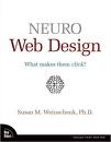
Neuro Web Design. What makes them click? - Susan M. Weinschenk,
2009, New Riders, ISBN 13: 978-0-321-60360-9, ISBN 10: 0-321-60360-5, 169 p.
A neuropsychological analyze of user behavior with particular application in web-design. Very easy to read with very clear examples. It contains information about persuasive techniques and other innocent tricks to convince you to buy a cheap Chinese tea cup, even if you have other ten at home. Yeah, it’s about manipulation. Most of the bibliography is from psychology.

GUI Bloopers 2.0. Common User Interface Design Don’ts and Dos - Jeff Johnson,
2008, Morgan Kaufmann Publishers, ISBN 978-0-12-370643-0, 433 p.
This book is dedicated mainly to programmers and managers. It explains what means interface design, why is important to implement interface testing before programming and, of course, how to avoid the “bloopers” during development stages. A rich bibliography and a lot of exemplification cases. If you are not sure what “blooper” is, imagine that you hear a mouse in the kitchen but you can not see it.

More Joel on software. Further Thoughts on Diverse and Occasionally Related Matters That Will Prove of Interest to Software Developers, Designers, and Managers, and to Those Who, Whether by Good Fortune or Ill Luck, Work with Them in Some Capacity - Joel Spolski,
2008, Apress, ISBN-13:978-1-4302-0987-4; ISBN-13:978-1-4302-0988-1, 292 p.
Long subtitle but it’s easy to read. It will hurt some feelings. Programmers feelings. It contains few things about usability and interface design and more about love-hate relations between characters from subtitle.
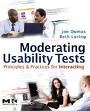
Moderating usability tests. Principles & Practices for interacting. - Joe Dumas, Beth Loring,
2008, Elsevier, ISBN-13: 978-0-12-373933-9, 206 p.
Usability test definition and principles, classification, features and everything else. The website of the book provides free of charge videos and documentation. A big accent is put on legal issues concerning human rights, inappropriate behavior or offending gestures that can occur during usability tests. It is useful for beginners because of detailed definitions and it’s useful for advanced moderators because real-cases presented. We tried to find something missing related the usability tests and we failed. The authors describe even the moderator position in the room during tests!
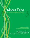
About Face 3. The Essentials of Interaction Design - Alan Cooper, Robert Reimann, Dave Cronin,
2007, Wiley Publishing, ISBN: 978-0-470-08411-3, 651 p.
Already 3rd edition. It treats interaction between humans and any kind of tools. There are general principles for identification of user needs and behaviour in using tools. Particularization of these techniques and principles for software products. It contains critical analysis of most common visual controls. This book is a “must-have”, even if there are more than 600 pages inside. You can not find the same revolutionary flame from the first edition, but may be this absence make the book more important and its ideas easier accepted by those working in the IT.
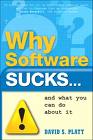
Why software SUCKS...and what you can do about it - David S. Platt,
2007, Addison-Wesley, ISBN 0-321-46675-6, 254 p.
Software sucks because is designed by guys! Well, as long as most of the programmers are nerds who enjoy cool stuff instead of useful stuff, like a two-children-mother would do. The book is easy to read and contains examples of bad interfaces in day to day actions. The frustration of using bad software is bearable for those who think that this is the only way, but it is extremely painful for those who recognise it in most insignificant moments. We couldn’t agree more.
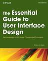
The Essential Guide To User Interface Design. 3rd edition - Wilbert Galitz,
2007, Wiley Publishing , ISBN: 978-0-470-05342-3, 912 p.
Another book at 3rd edition. It approach both theory and principles of interface design and description of most important visual objects. Each of those is depicted in 4, and after that in another 4 and so on until 912 pages are full. Only the references are on 24 pages. All subjects are described using lists of characteristics, advantages and disadvantages. There are a lot of subtitles and small paragraphs and this allow you to read randomly without loosing the coherence. Numerous comparisons between different styles and approaches. Most conclusions are based on well documented research studies.
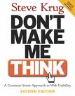
Don’t Make me Think, 2nd edition - Steve Krug,
2006, New Riders, ISBN:0-321-34475-8, 216 p.
We discovered that this is the most read book about usability. In fact it’s not much to read because is full of big letter titles and pictures. The web design principles are presented in a so obvious way that you feel you always knew them but you weren’t aware of them. If you know nothing about usability, interface design or other similar fancy words, this is by far the first book you should read. It will not make you think! It will make you appreciate it!

Paper Prototyping: The Fast and Easy Way to Define and Refine User Interfaces - Carolyn Snyder,
2003, Morgan Kaufmann Publishers, ISBN:1558608702, 408 p.
Paper prototyping is an easy and very effective way to perform an usability test. It consists in drawing the interface of any kind of software on paper. It is particularly useful in early stage of development. The author describes deeply the features of this testing technique, but includes also general but very useful details about what you should and shouldn’t do during usability tests. Read it once, apply it always!
* IT ENDS HERE *