Business Objective
TO THE TOPProvide visual consistency among various digital products in the portfolio.
* * *
The Context
TO THE TOPThe organization develops its own software products, but also acquires additional companies to extend its market reach.
The apps targeted for visual consistency were developed by different teams, using different technologies, and featured unique user interfaces—not only in appearance but also in interaction patterns.
The marketing department built and maintains a brand strategy, but only for marketing materials and the presentation website.
* * *
The Strategy
TO THE TOP
STEP 1
• Identify the business opportunities associated with this initiative,
• Acknowledge previous efforts toward consistency,
• Align with the various front-end teams,
• Unify prototyping procedures.
STEP 2
• Obtain explicit commitment from C-Level management,
• Set the scope for the new Design System,
• Align on the definiton of success metrics,
• Define a communication strategy for internal and external stakeholders.
STEP 3
• Develop a Figma UI Kit and the Design System Guidelines,
• Establish procedures for Change Management of the Design System,
• Assess the front-end effort required to develop and maintain DS components,
• Build an implementation time-line with progressive steps.
First step requires implementing only the basic branded elements, such as the logo, colors, fonts or icons.
* * *
The FIGMA UI Kit
TO THE TOP
The Figma UI Kit was built with two main objectives in mind:
• Ensure consistency among very different active systems, and
• Minimize the prototyping effort for designers.
The DS Guidelines provide details about all states for each component, but the Figma components cover only the most commonly used states in prototyping.
For example, in the case of a button, the available variants include only "default," "hover," and "inactive."
The main sections of the Figma UI Kit are "Icons", "Basic Components", "Complex Components", and "Dashboard". Additional sections contain components specific to each active system.
The Figma variants are grouped to allow quick changes in prototypes during iterations. For example, radio buttons and checkboxes are variants of the same component.
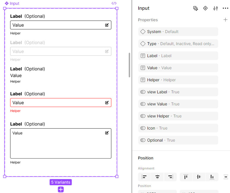
All properties for components are named consistently. In this way, This ensures that when components are swapped, values such as text content or supporting icons visibility are preserved.
* * *
Lesson Learned
TO THE TOPA Branded Design System can be flexible, with an implementation period streched over several years.
* * *
Feedback
TO THE TOPWhat do you think about this case study?
"Submit" is working if you select first an option!
Thank you!
It's good to know!
* IT ENDS HERE! *