Business Objective
TO THE TOP
Update the interface for a 15 years old application. The back-end part should stay untouched.
The application controls a scanning device for material management in warehouses and on production lines.
The application has 4 modules, covering more than 80 different tasks.
The simplest task is scanning a bar code and displaying details about the scanned item.
The most complex tasks require multiple inputs of various types of data plus physical movement between 2 or more locations.
The touchscreen function is deactivated and the control is done through functional keys only.
* * *
The Device
TO THE TOP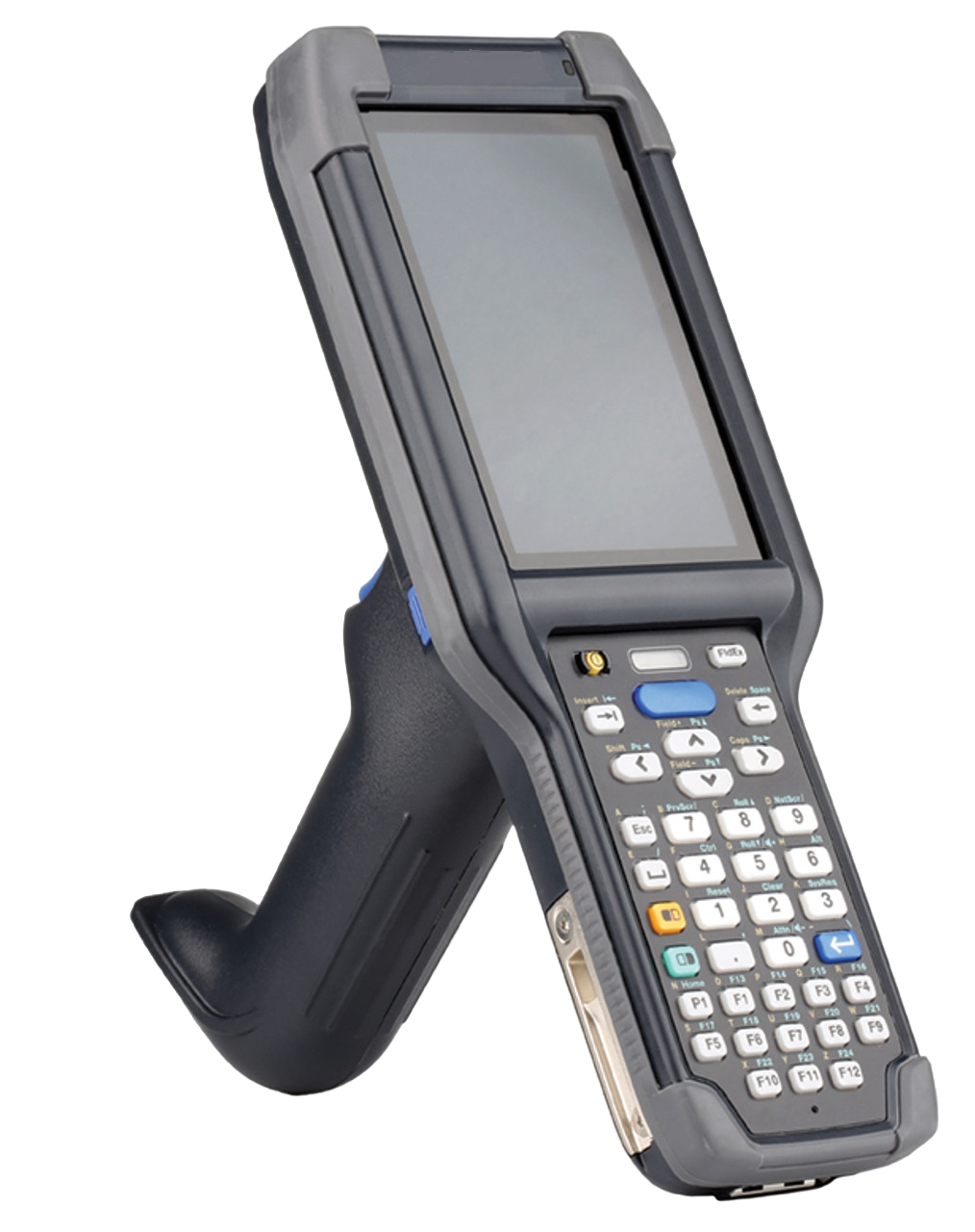
The scanner is produced in various sizes and weights, by numerous companies.
The device is used in 14 factories spread on all continents.
It's shock resistant as being often dropped on the floor or hit with heavy objects.
* * *
The Old Software
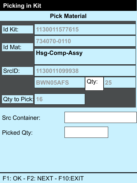
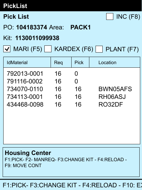
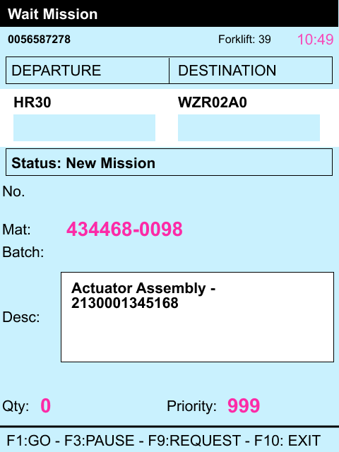
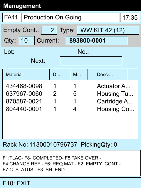
TO THE TOPIt was a time when nobody cared about design!
Numerous modules were obsolete, or never placed in production, or used for a very specific process in a single location.
Because of poor readability, many users have relied entirely on acoustic warnings to confirm the successful completion of the tasks.
* * *
The New Software
TO THE TOPTwo different design approaches were proposed for the business owners, as part of a more complex design strategy.
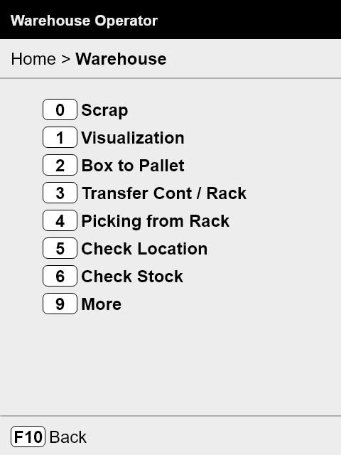
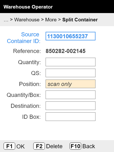
1st Design Approach
Minimum intervention on content, and improve the navigation features.
2nd Design Approach
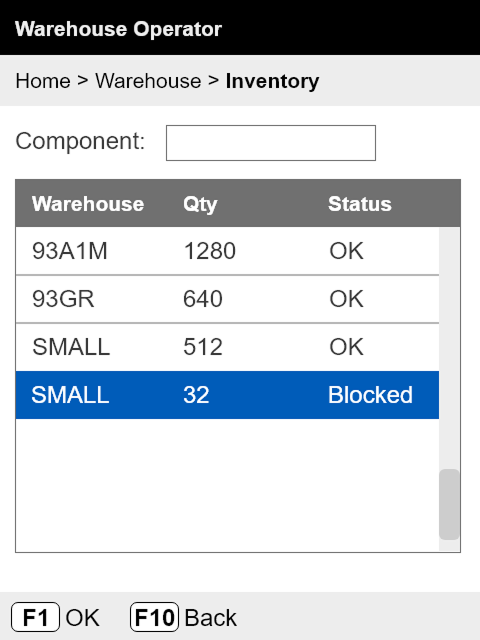
Besides better navigation, it has new features for readability.
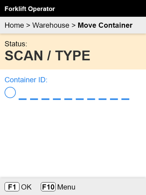
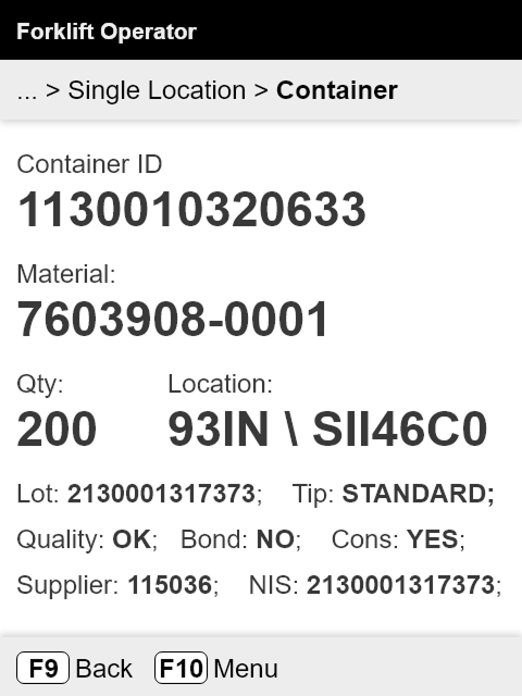
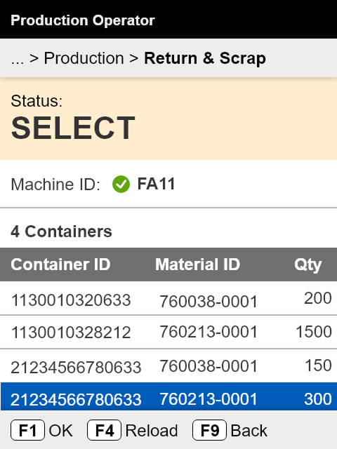
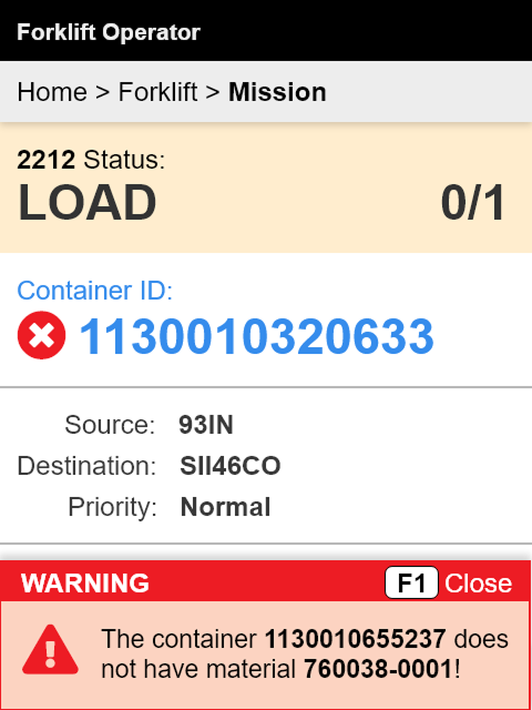
But the most important improvement is the switching from data-oriented design to task-oriented design.
2nd Design Approach won!
Because of artificial light and numerous dark areas in the large warehouses, the dark mode was a necessity.
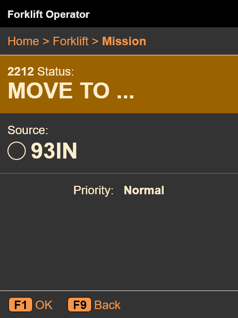
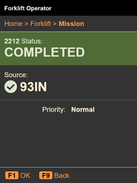
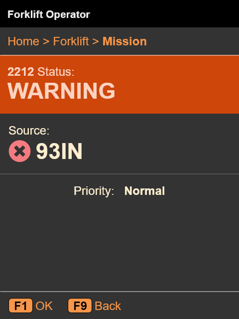
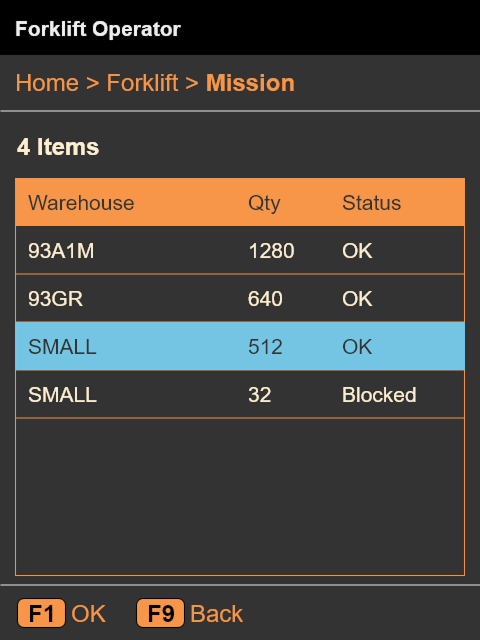
Support information was completely missing in the old app and was strongly needed as the UX research proved. The support information mapped 1:1 the entire structure of the application, and switching from the "Work" mode to "Support" mode is done through the F12 key.
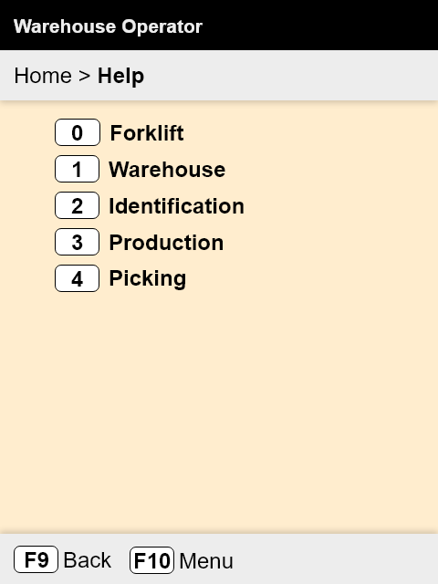
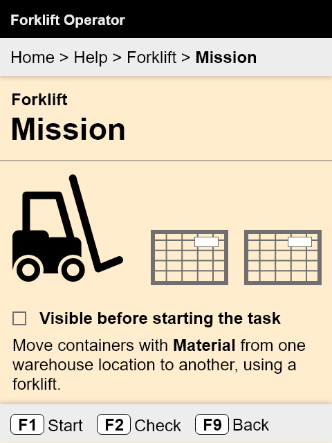
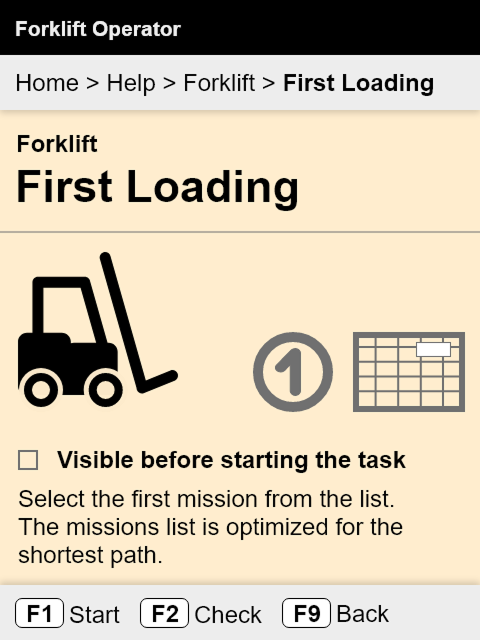
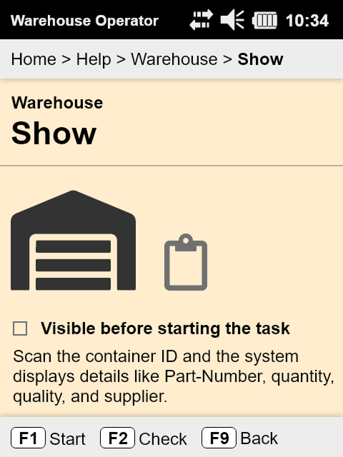
The design process was not straightforward at all. Each major visual enhancement went through several iterations.
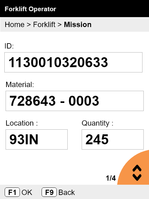
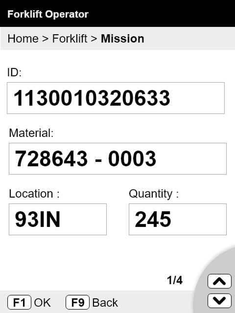
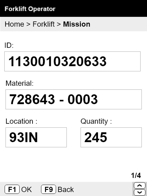
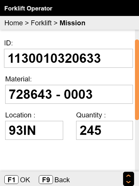
For example, the old application didn't have scrolling. One design challenge was to emphasize, where is the case, that the page is scrollable now. This required an important change of the usage pattern. The solution was found through iterations and usability testing.
* * *
Downsides of Working Agile
TO THE TOPThe UX research and design phase started only two weeks in advance of development. Because of the short time available for research, some of the initial solutions proved to be wrong later, when more complex modules were studied.
The final product has some inconsistencies because the design phase overlapped with the development.
* * *
Lesson Learned
TO THE TOPDevelopment should start only after UX Research and Design phases are completed.
* * *
Feedback
TO THE TOPWhat do you think about this case study?
"Submit" is working if you select first an option!
Thank you!
It's good to know!
* IT ENDS HERE! *